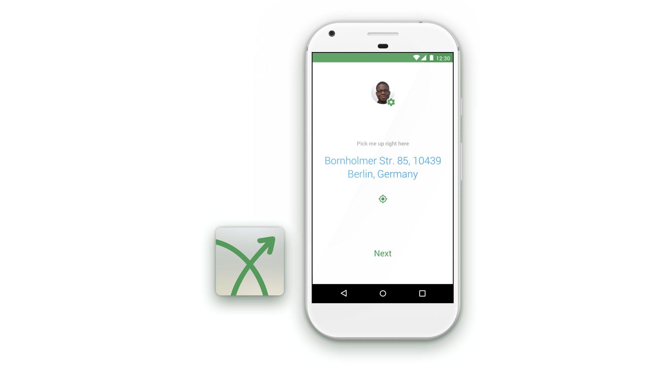
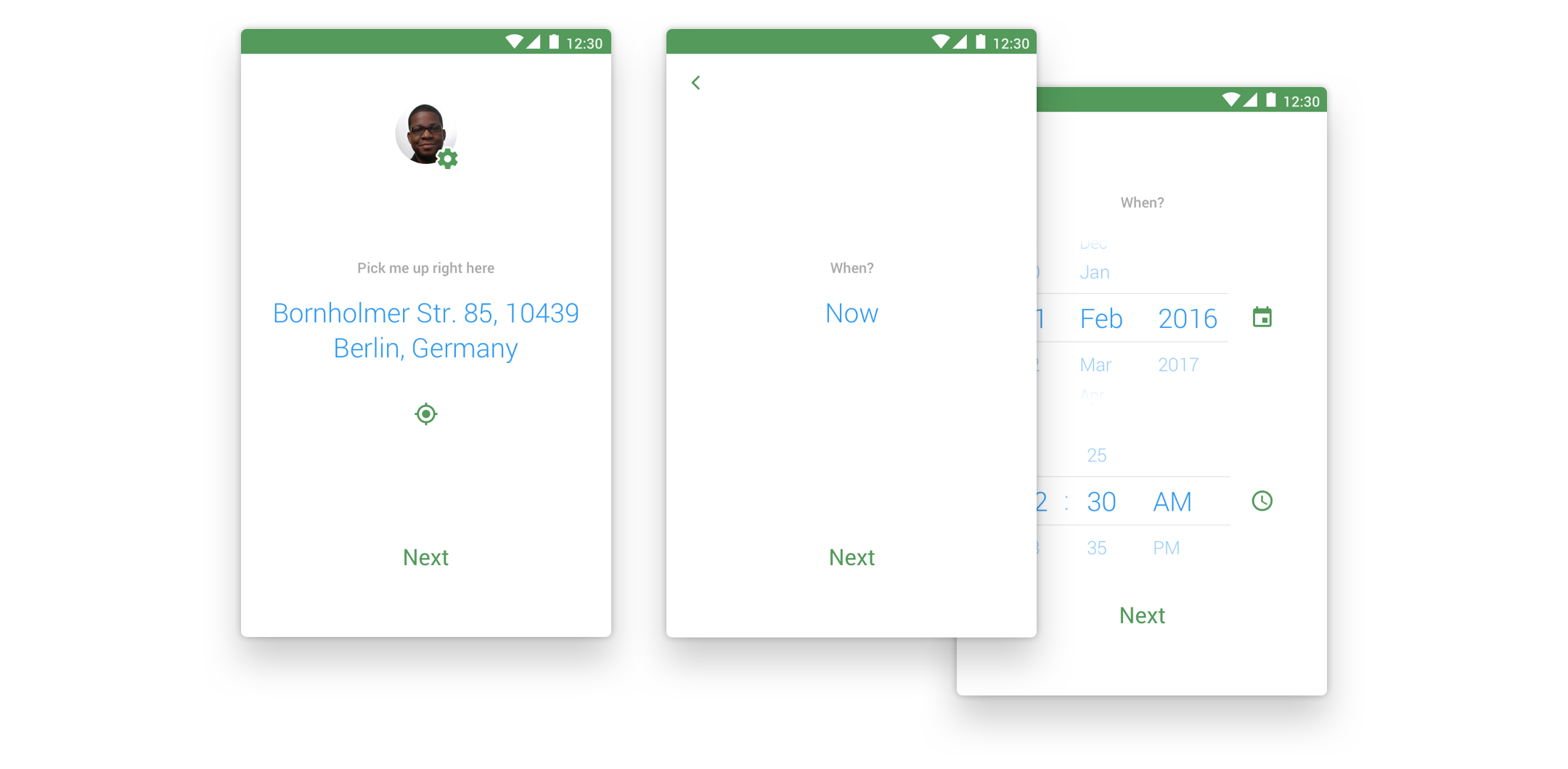
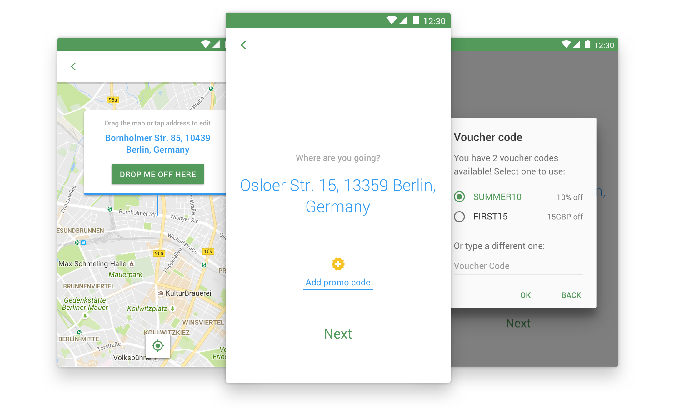
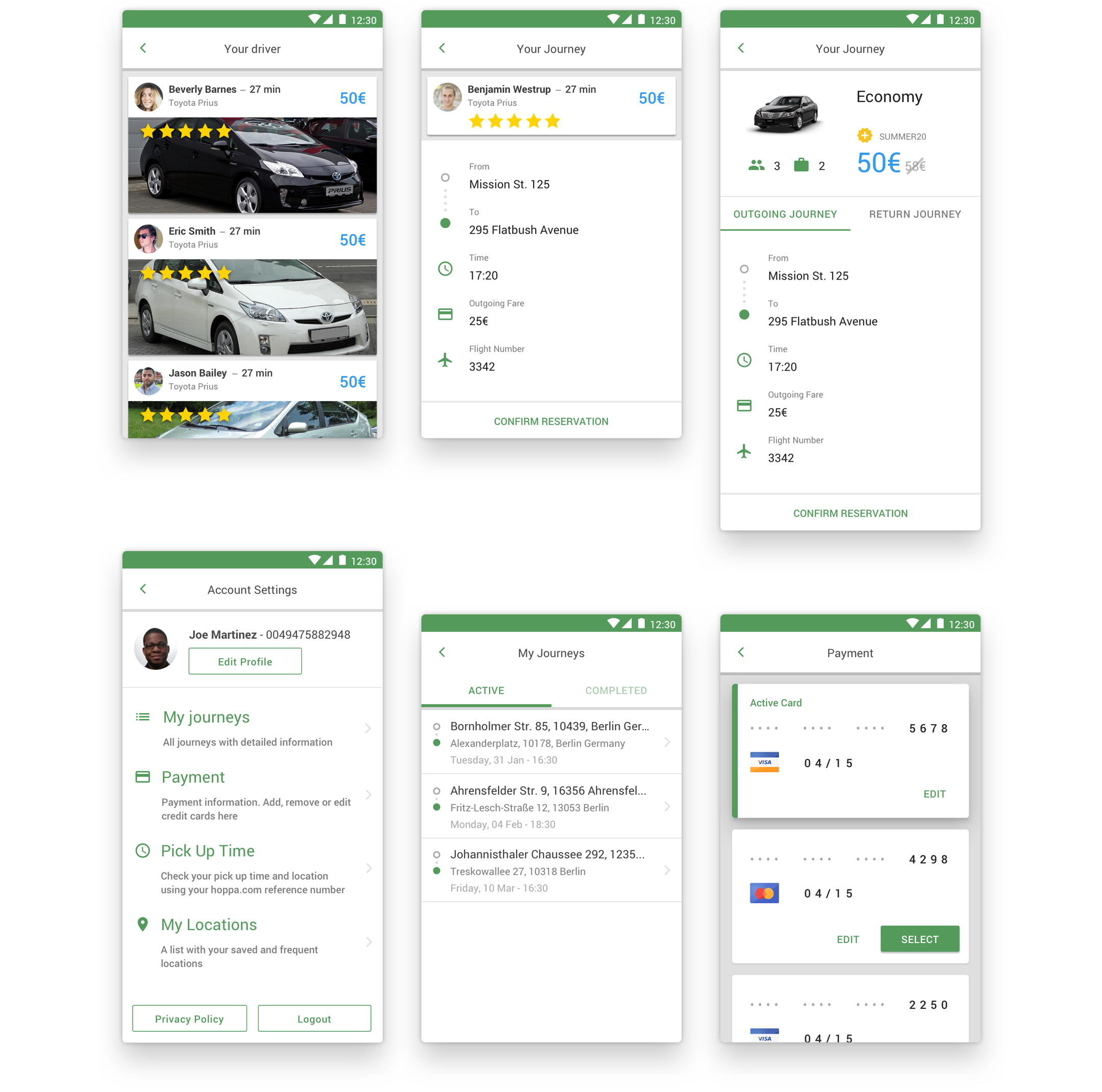
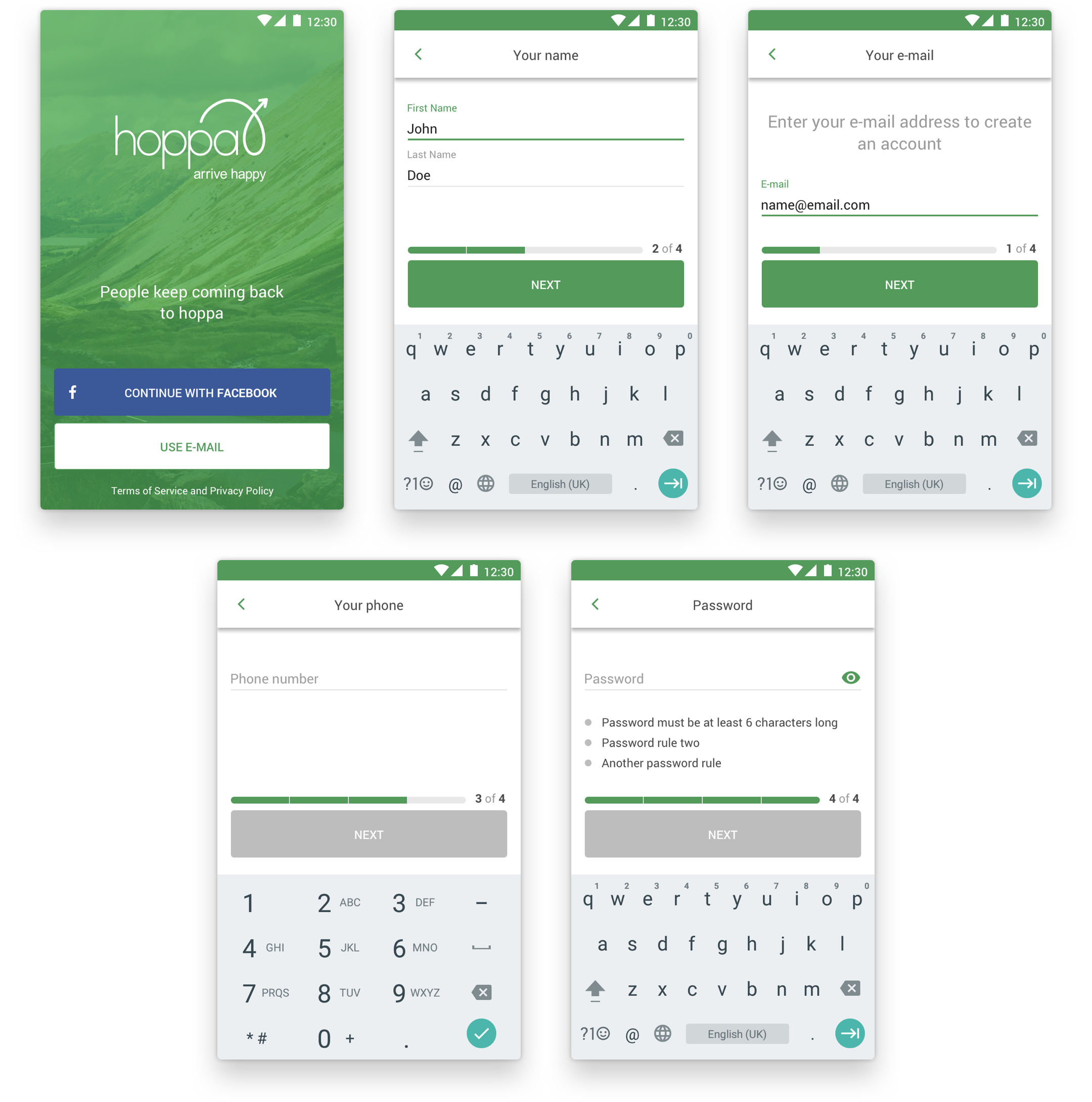
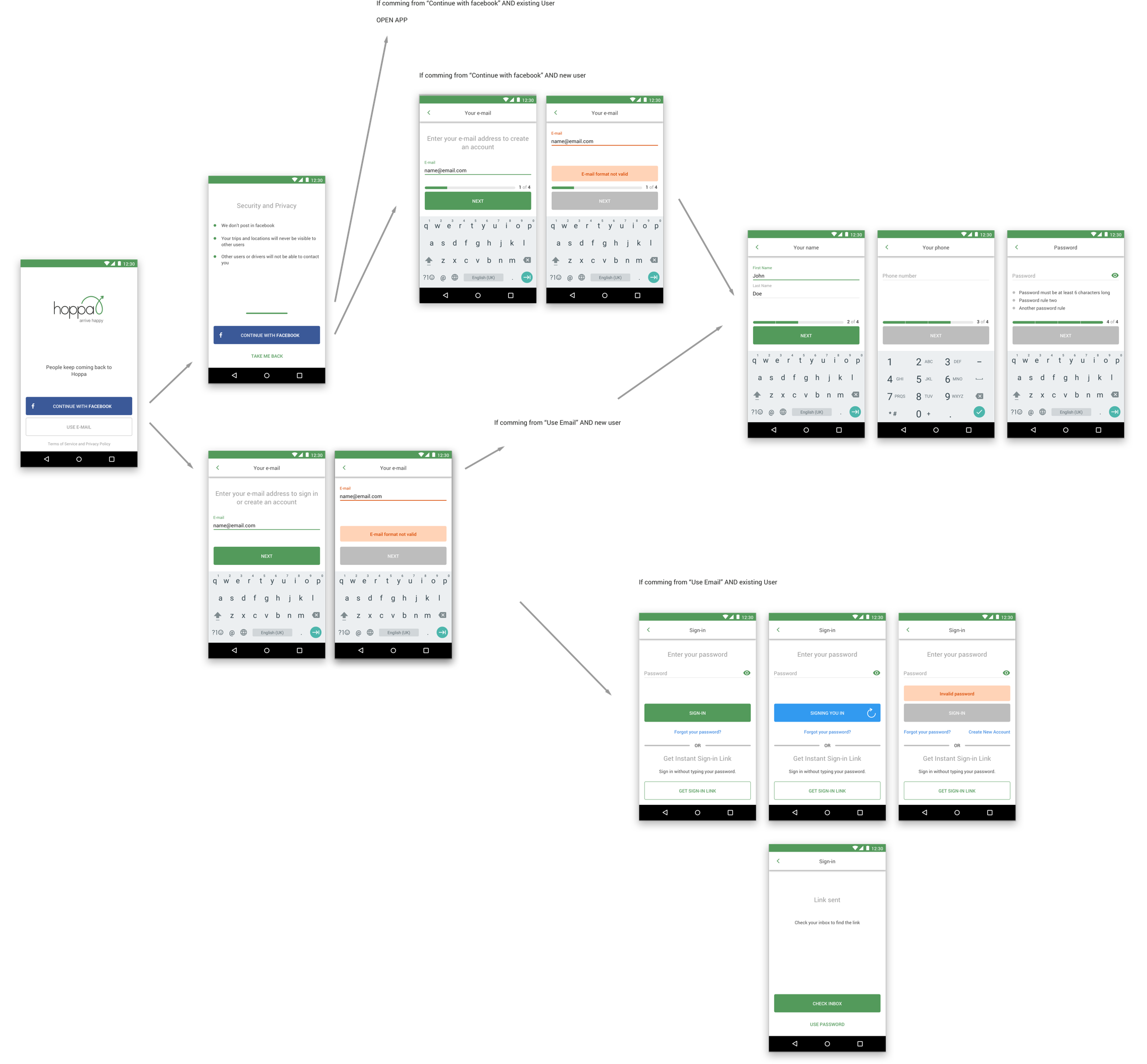
From the beginning the passenger app was designed to be very simple to use. Most passenger booking apps present a lengthy form that requires a lot of information to be inputted at the same time. This creates an unnecessary cognitive load. We conceived an experience where each step of the process has its own screen with simple and bold interactions.
Hoppa
Hoppa is one of the biggest city and resort transfers company with presence in 116 cities.
The passenger apps are the product that passengers use to make on-demand or scheduled reservations. These applications are easy to use and very clear while they follow Hoppa’s existing brand. Our goal was to conceive a different experience from other booking applications by creating a simpler experience designed for a less tech-savvy user base.
My role
Take care of brand consistency within the existing guidelines
Responsible for the User Experience and User Interface design
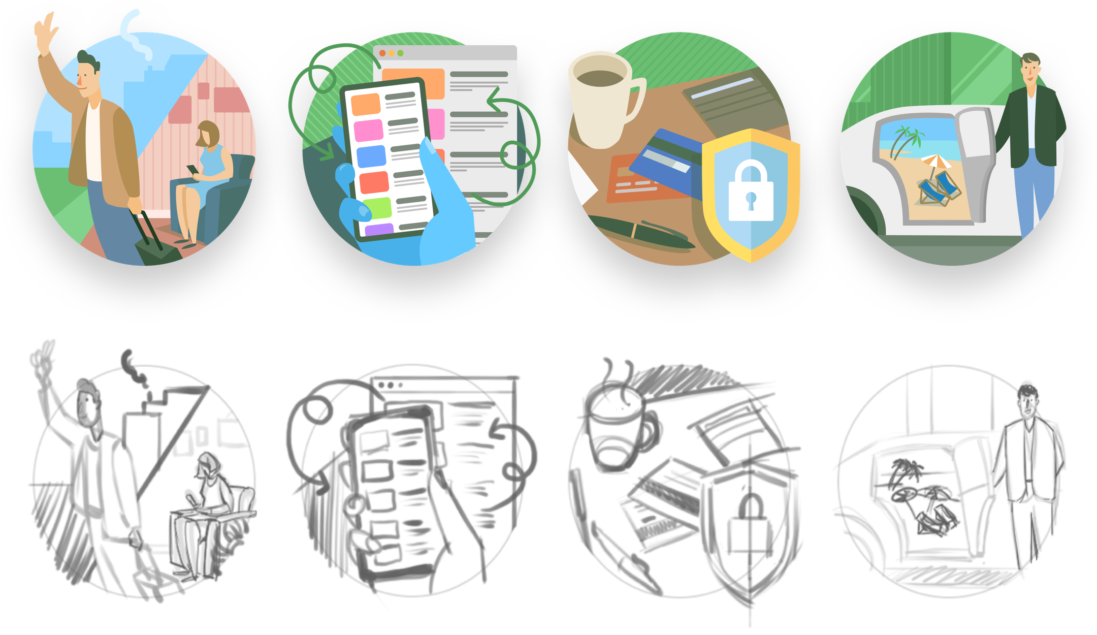
Create sets of illustrations for the app and other uses
