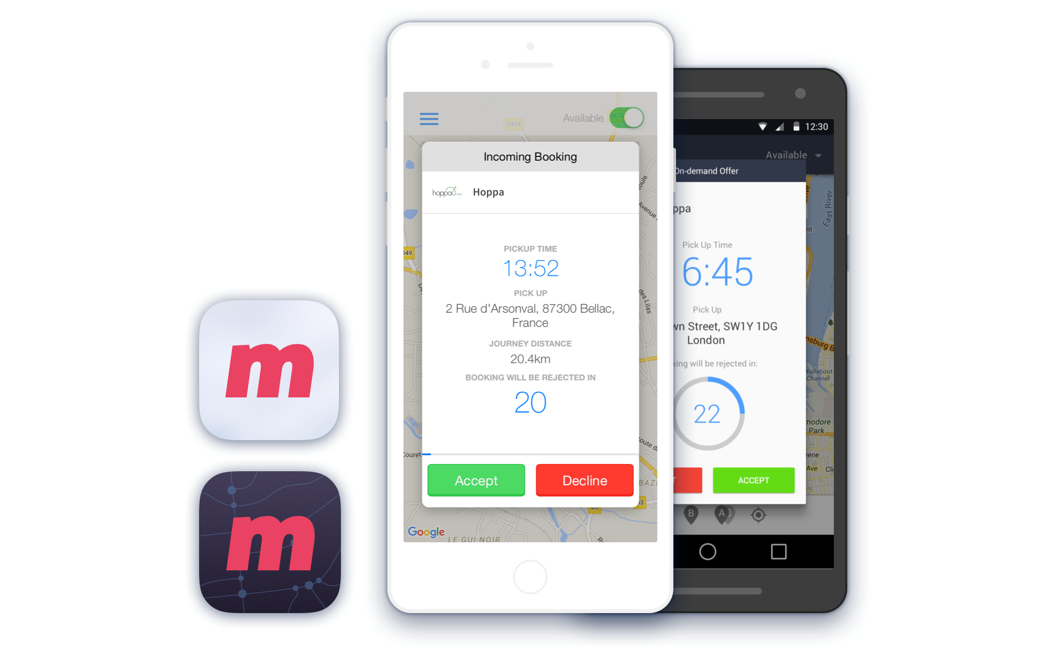
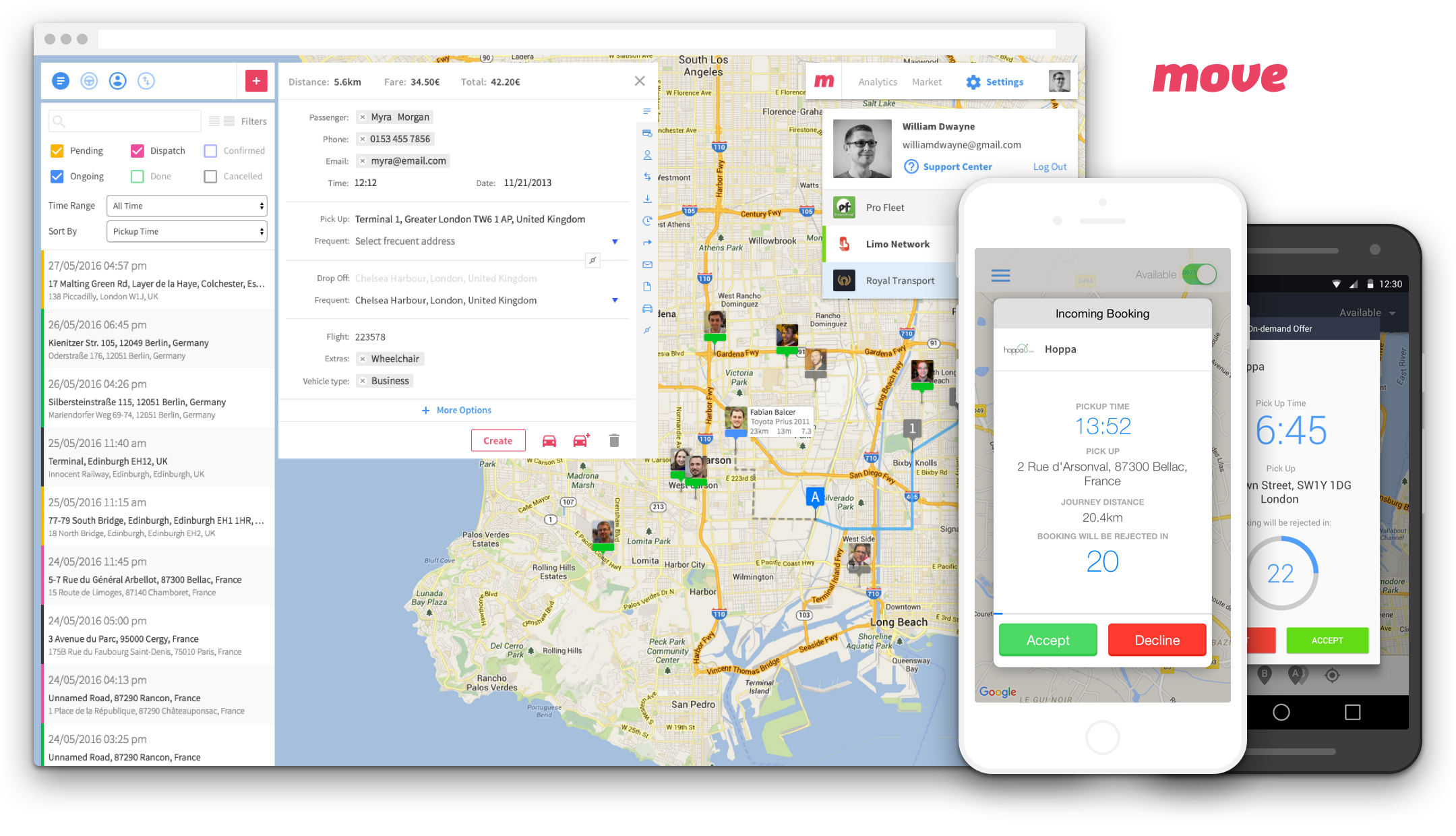
Move Dispatch System

Move is a SaaS dispatch application for taxi and chauffeur companies. The application and brand identity were created from scratch and developed into a fully functional product. We wanted to detach ourselves from previous solutions that relied on manual input and complicated workflows. With Move and its mobile applications, drivers are live-tracked and any change in their status is notified to the dispatcher automatically.

My role

  • Responsible for the User Experience design

  • User Interfaces design for web application and mobile apps

  • Creation of the brand design and general visual language

  • Design and coding of several websites and landing pages

image

Brand Identity

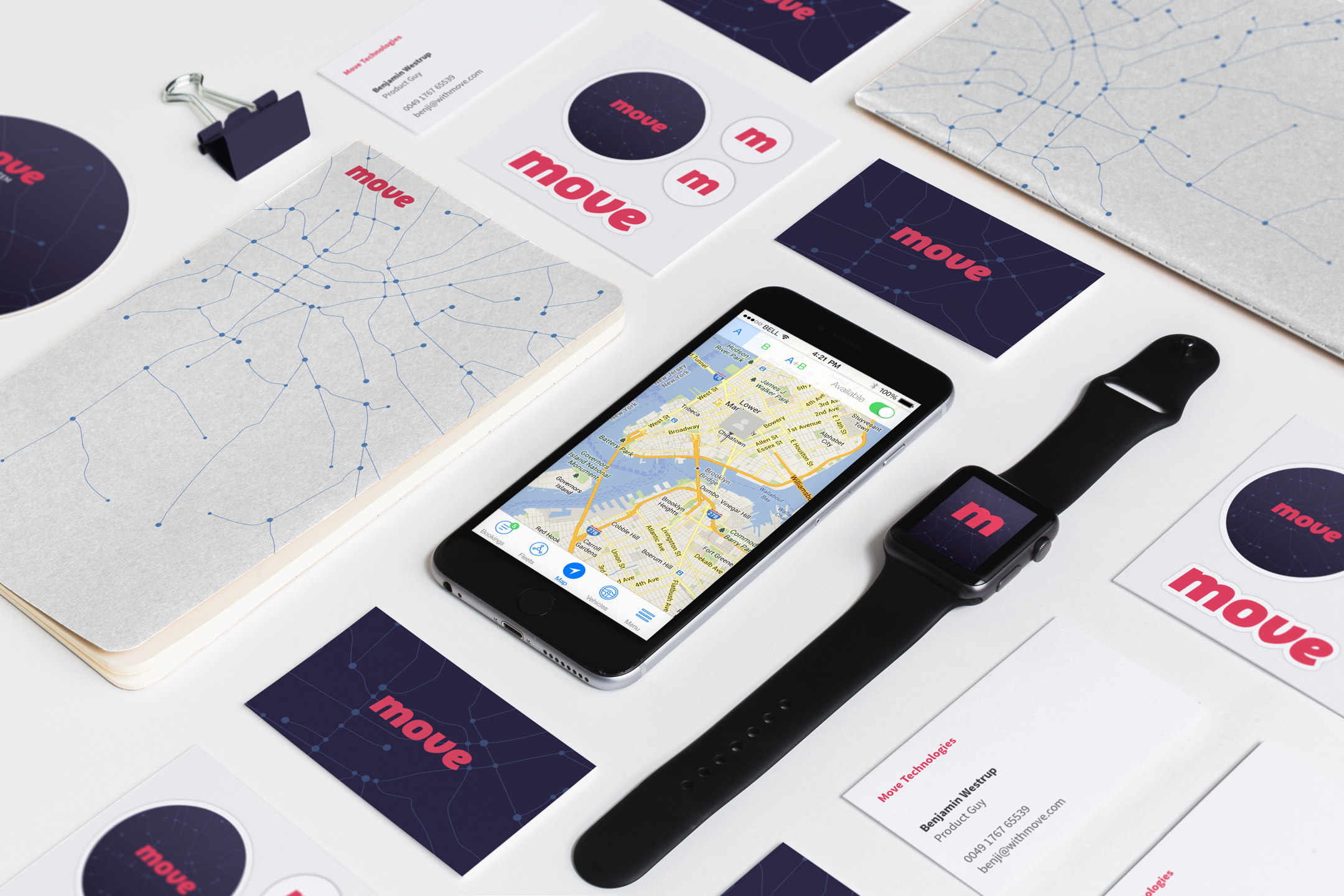
The brand identity of Move focuses on creating a professional, reliable and forward-thinking dispatch system. A software application that feels reliable and solid while intuitive and easy to use.

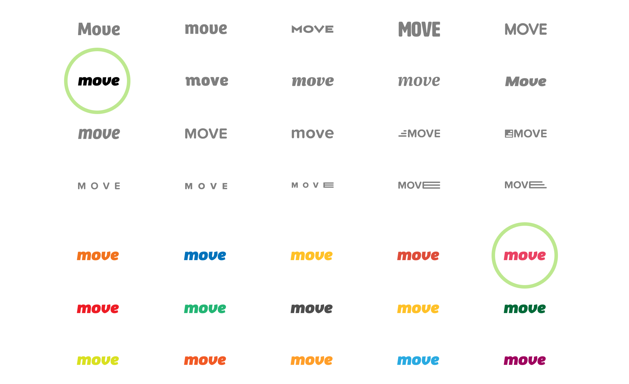
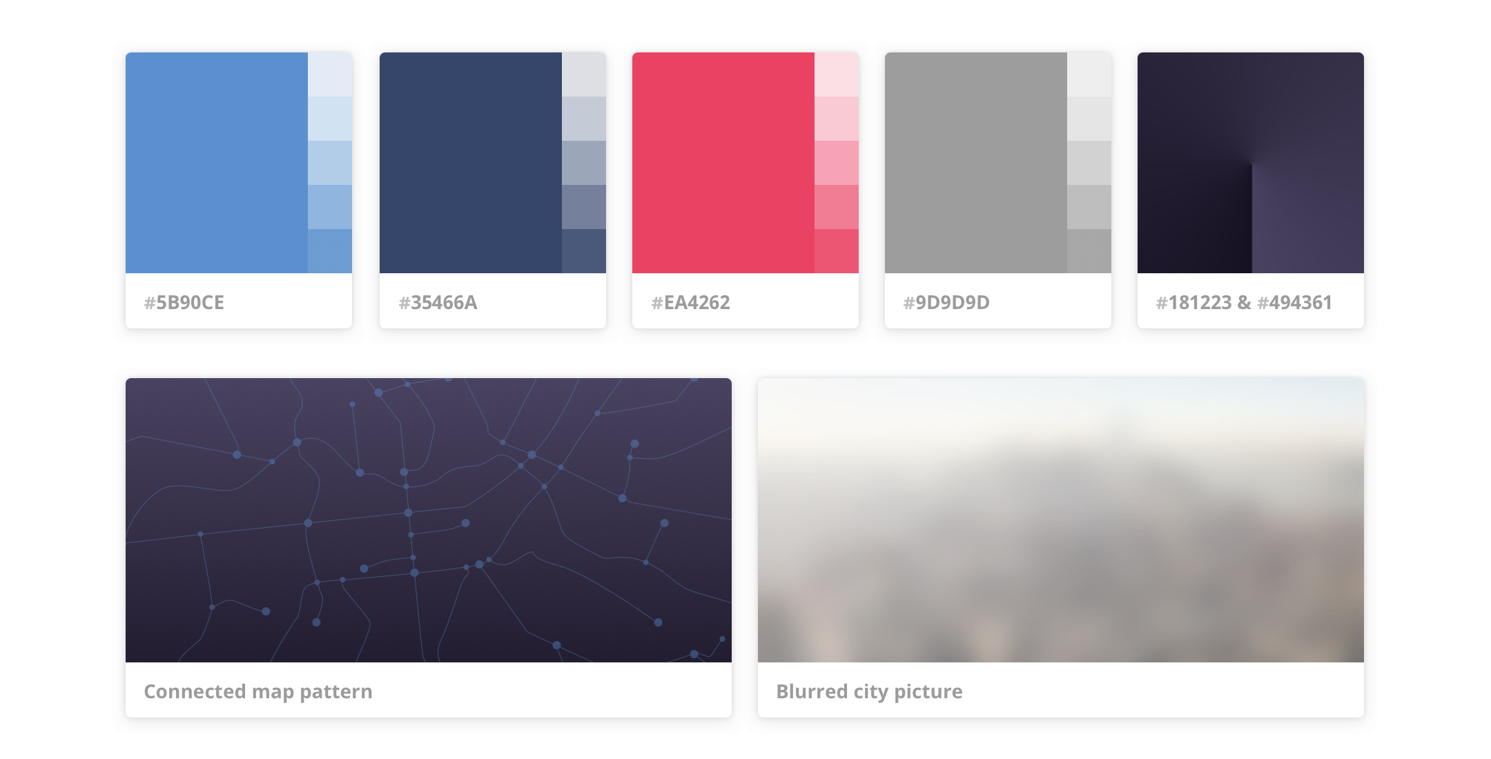
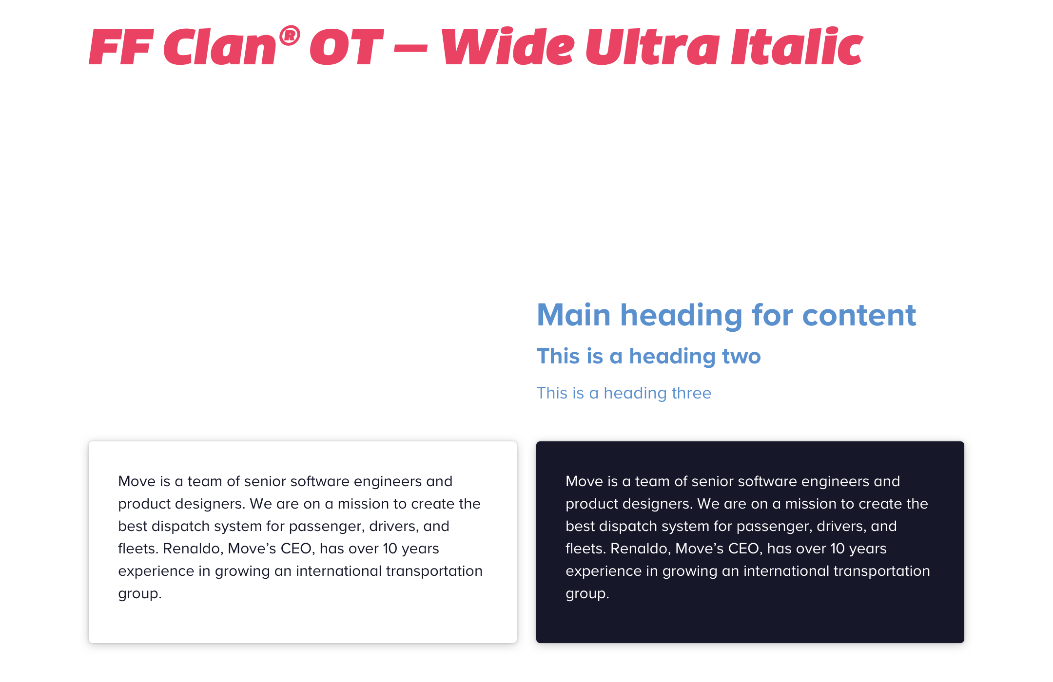
The color and character

In selecting the colors for Move’s brand we wanted to differentiate ourselves from other dispatch software that largely rely on yellow, black and white (archetypical taxi colors). The election of a bright magenta and dark shades of blue gives impact and character to the brand.

image
image
image
image

Typography for logotype and text

Two typographies were selected for Move’s brand. FF Clan by Lukasz Dziedzic and Proxima Nova by Mark Simons. Both typographies are extremely readable and clear.

To give the identity contrast we used a heavy weight italic style for the logotype and went with lower weights using Proxima Nova, a more geometric typeface for the content.

image

Product website

For Move’s product website we created four main pages. The Home Page is the main page where we explain the most important benefits of using Move. This page is divided in sections targeting the main users of the software and their needs: fleets value control and opportunities to connect, drivers flexibility and passengers reliability and being able to book on demand.

The About Us and FAQ pages are intended to give the customer more information and build trust in the product and the team behind it. The pricing page offers two models, Standard and Pro in four major currencies. After several iterations, an Enterprise model was not added to the main section, but rather offered as a custom solution.

image
image

Dispatch software in the browser

The web application has three main sections: The Map, where the dispatcher or fleet manager can access and live-track important information about bookings, drivers and vehicles. The Settings section, where features can be setup, drivers added and different aspects of the app customised in detail.

Lastly the Market, a marketplace for fleets and drivers where they can connect and share reservations. This section was designed as an e-commerce website where fleets or drivers can sign new contracts and share legal documents.

image
image
image
image
image
image
image
Application settings view.
image
Move market, a centralised market-place for drivers and fleets.

Components and icons

Modularity in an advanced user interface is fundamental. The user interface was designed with components that can be used in different parts of the application. The application needs to feel responsive and fast, hence the avoidance of superfluous interactions or animations.

Because of the complexity of the application and the need for all information to be easily accessible we relied on custom sets of icons for the main navigation in different sections. Important patterns are repeated across the system to create an intuitive experience for the user.

image
image
Form elements for the application settings.

Driver Application for Android and iOS

The driver apps are the connection with the drivers, they are intended to be a functional and clear tool. They adhere strictly to Google Material Design Principles as well as iOS Human Interface Guidelines.

I worked together with the mobile developers to create a reliable and clear experience for the drivers. We intentionally avoided animations or distracting interactions.

image
image
Different views from the main app flow for Android (top row) and iOS (bottom row)
image
Early flowcharts for the main application user flows